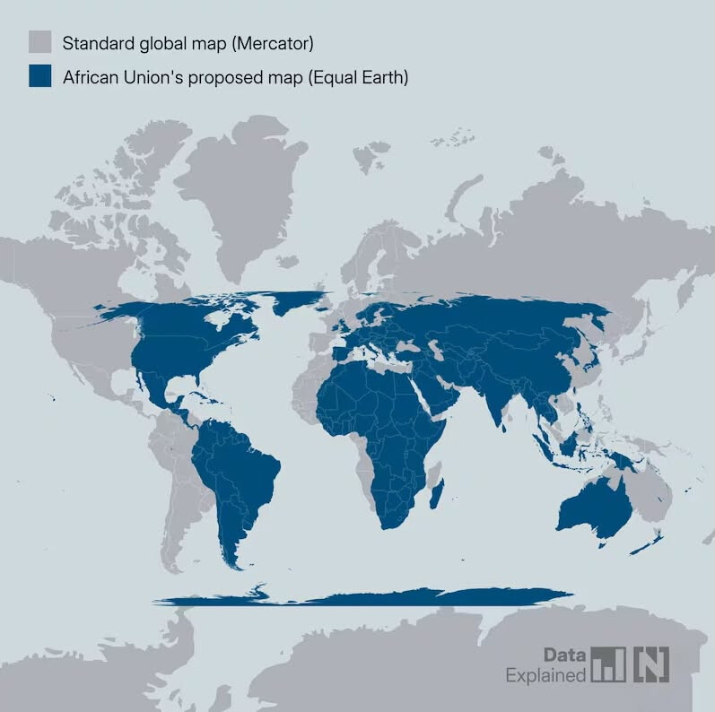
04.09.2026, the UN General Assembly adopted a resolution recognizing that the Mercator projection—well known to us from atlases—is overly distortive of reality, confirming that the alternative Equal Earth projection represents the world better, and encouraging its widespread adoption.
After all, the distortions of the Mercator projection have long been known to us. Greenland appears huge on Mercator maps, even though in reality it is about 16 times smaller. russia is also massive on them, despite actually being about 5 times smaller than it seems on a Mercator map. Canada also comes across as roughly 5 times larger, and the US about 2.3 times larger.
The Equal Earth projection isn’t perfect either, as sacrifices are inevitable when flattening a round object. However, Equal Earth is undoubtedly a better representation of our home planet than Mercator’s 16th-century creation.
Personally, I actually like the AuthaGraph projection created by the Japanese designer Hajime Narukawa, which preserves both the correct size and shape of the continents, though it sacrifices cardinal direction accuracy in the process.
Is Mapillary planning to modernize its 16th-century map background?