Introducing a Mapillary-ArcGIS Experience Builder Integration Widget (Mapillary Explorer)

Hey everyone,

I wanted to share a small open-source contribution. I’ve been working on an ArcGIS Experience Builder widget that brings Mapillary street-level imagery directly into Esri environments.

While Mapillary already provides various integrations for ArcGIS (as listed on the website of Mapillary /arcgis), there was no Experience Builder integration among the existing GIS solutions, so I decided to build one and share it with the community.

The idea is to help cities, municipalities, and organizations with limited budgets quickly integrate free Mapillary street-level imagery into their ArcGIS applications, visualize captured data, and even contribute back by enriching the existing imagery with their own surroundings.

:link: GitHub repository: https://github.com/sukruburakcetin/mapillary-explorer

:link: Demo: Video on YouTube

Technical highlights:

  • Built as a custom widget for ArcGIS Experience Builder (React + Esri JS API).

  • Uses MapillaryJS for immersive image viewing and sequence navigation(to preserve the spatial and temporal structure of Mapillary imagery).

  • Integrates with Mapillary API v4, fetching image positions and metadata to sync with ArcGIS FeatureLayers.

  • Includes reverse geocoding to identify and display address or location details for each captured image.

  • Includes spatial interaction between the map and viewer (click events, sequence tracking, dynamic highlighting, sequence caching).

  • Designed for lightweight deployment and customization in Esri environments.

It’s still evolving, but fully functional. The widget connects with Mapillary’s API, allowing users to explore sequences and interact with spatial features within an ArcGIS web map.

I’d really appreciate any feedback or thoughts from the Mapillary and Esri communities.
Would love to know if this could be something that fits into the broader Mapillary ecosystem or could help inspire official integrations in the future.

3 Likes

This is awesome! Great work @sukruburakcetin !

1 Like

Mapillary Explorer Widget - Latest Update and Feedback Request (v2.1.2)

Dear Community Members,

I’ve just released a new version of the Mapillary Explorer widget for ArcGIS Experience Builder, and I wanted to share what’s new in this update. This release focuses on performance, smoother viewing, and better access to Mapillary’s vector data layers.

What’s new:

  • Turbo mode: much faster image loading and smoother navigation.

  • Hover previews: see image thumbnails by simply hovering over features on the map.

  • Filtering options: filter images by creator username, capture date, and whether they’re panoramic or not.

  • Extended cones: directional cones now adjust dynamically with the zoom level, giving better spatial context.

  • Vector tile access: full access to:

    • Mapillary coverage tiles

    • Mapillary traffic signs layer and features

    • Mapillary objects layer and features

You can see all of this in action in the new demo video:
:play_button: Watch on YouTube


Looking for feedback:
Right now, the widget still includes both Normal mode (multi-sequence) and Turbo mode. However, Normal mode tends to reload images more slowly, which can affect usability.

I’m considering removing Normal mode altogether and making Turbo mode the only option in the future. Before making that change, I’d really like to hear your thoughts, do you still find Normal mode useful, or would a Turbo-only version make more sense?

Your feedback has always been a valuable asset in shaping this project, so any input is greatly appreciated.

  • Both modes are great
  • Make it turbo mode only
0 voters

Thanks again for all your support! :smiley:
@asturksever

2 Likes

Wow, these are excellent updates - thank you for all of this work and the excellent walk-through videos!

2 Likes

I’m fine with both modes. “Normal” is a no frills, basic version and “Turbo” has options and fine-tuning.

I would really appreciate if I could pick-and-chose the Turbo features to deploy. For example, I’ve never been a fan of either of the detection layers because the object layer is is too cluttered and full of transitory objects like trash cans or traffic cones while the sign layer misses most of the signage in my study area.

I would like to expose the speed of Turbo mode’s cache and filter to just my images, while not overwhelming my users with unnecessary layers.

So far, I’m very happy and looking forward to future developments.

Thank you

2 Likes

Thank you so much for the thoughtful feedback, dear jcueno, it really helps.

As the next step, I’d like to experiment with building a settings panel that can consume config parameters, similar to what Jeffrey Thompson (JeffreyThompson2) did in his Fancy Filter widget.

In the example shown here:
https://community.esri.com/t5/experience-builder-custom-widgets/fancy-filter-widget-s/ta-p/1660506?lightbox-message-images-1660506=142544i9DA6E9E14F3C92CC

you can see that creating configuration parameters inside setting.tsx is absolutely possible.

My initial idea was to start simple:

  • add a config option for defining the zoom level at which Turbo mode activates, and

  • allow the widget user to enter a creator.username value instead of hardcoding it, with the entered value being passed directly to manifest.json.

But based on your feedback, it also makes sense to include options for enabling or disabling certain Mapillary layers, such as traffic signs or object layers. We could even go further and include checkboxes to activate Normal mode, Turbo mode, or both, depending on the needs of the app.

Turbo mode essentially mimics the full functionality of the Mapillary web interface. However, when I first started this project, I wanted to keep things a bit original, so I spent a lot of time developing Normal mode based on the principles of lazy loading, context-driven data loading, and on-demand spatial querying.

Later I realized that Normal mode wasn’t ideal for users with slower internet connections, which is a very real situation in many countries, so I introduced Turbo mode. And since I didn’t want to discard all the work put into Normal mode and also wanted to future-proof the design, I kept both modes. I’m really glad to hear you like both.

Regarding the traffic sign layer: one reason you see fewer sign types than expected is that Mapillary actually sends more traffic-sign features, but many of them cannot be displayed because they don’t have a corresponding sprite. For example, “General Traffic-sign G1” and similar detections have no actual icon representation. When I checked the Mapillary website, I noticed they also hide these icon-less signs, so I decided to do the same to avoid confusing users who compare the widget with the official site.

As you can see in the sprite sheet:
https://raw.githubusercontent.com/sukruburakcetin/mapillary-explorer-sprite-source/refs/heads/main/sprites/package_signs/package_signs.png

there are some empty sprite slots. Even though Mapillary’s automation detects these features from street-level imagery, they are not displayed. In previous versions, you could see them highlighted in orange in the footage you shared, but in the latest patches they’re hidden simply because no icon exists for them. Maybe someday the Mapillary team will update their sprite sources to include icons for all feature types.

Lastly, in the most recent update, I added a feature that allows filtering layers to show only specific “x” items. The filter options can increase or decrease depending on the variety of features/icons available at the current zoom level.

As shown in the photo:

I’m really glad to hear you’re happy with the progress so far. Your feedback genuinely helps shape future improvements. :hugs:

2 Likes

Hi everyone :blush:,

I wanted to share some good news with the community. Mapillary Explorer v2.8.1 has just landed, and it includes several updates focused on making exploration, analysis, and everyday use more flexible and comfortable.

Here is what’s new.

New settings panel capabilities
You now have more control over how Explorer behaves:

  • Turbo Mode Only lets you lock the app into coverage analysis mode and disable standard navigation, which is especially useful for focused QA or analytics work.

  • Default Creator allows you to pre-fill the username filter on startup, so data from a specific contributor loads automatically.

  • Force Coverage Layer keeps the Mapillary street geometry layer always visible, giving you consistent spatial context at all times.

  • UI Customization lets you hide the Traffic Signs or Mapillary Objects buttons if you don’t need them, helping reduce visual clutter.

Date-based visualization
There is now an optional year-based color coding for coverage points. This makes it much easier to see how imagery coverage has changed over time and supports temporal analysis at a glance.

Improved Mapillary assets and feature layer management
Traffic sign and object layers are handled more efficiently, with better filtering and cleaner rendering. This should be especially noticeable in dense areas with lots of points.

Fullscreen minimap
In fullscreen mode, a secondary minimap is now available. It allows you to track your route visually and click anywhere on the minimap to jump directly to a specific frame in the sequence.

Adaptive UI from desktop to mobile
The interface now scales smoothly from desktop to mobile. Controls are touch-optimized, layouts adapt to screen size, and UI elements are injected dynamically to fit the device you are using.

If you want to see all of these updates in action, you can check out a longer walkthrough video of the current version, which goes through the features in detail and should be useful for everyone:

Watch the video

These updates aim to enhance the power of Mapillary Explorer while maintaining its ease of use and enjoyment. With the current release, Mapillary Explorer has reached a level of maturity where it feels stable and reliable enough to be usable in enterprise-level workflows. The overall performance, feature set, and UI behavior are now consistent and predictable, making it suitable for more serious, large-scale usage scenarios while still remaining community-driven and open source.

I wish you all a healthy year filled with happiness, spent with your loved ones.
@boris @asturksever @jcueno

3 Likes

Great to see Mapillary generated assets are easily accessible with their metadata on the widget

1 Like

Wow, very cool! Looks super, nice work @sukruburakcetin !

Hi everyone, and happy 3 Billion Images Mapillary! :smiley: :green_heart:

This could be a long read, but I wanted to properly share the full scope of what has been completed. :blush:

Starting from version 2.8.1, the widget has gained many valuable capabilities that significantly expand its flexibility and usability.

You can now hide individual UI components to simplify the interface and tailor the experience to specific workflows. Render and transition modes can be configured directly in the settings, and the default camera angle can be set to control the initial viewing direction.

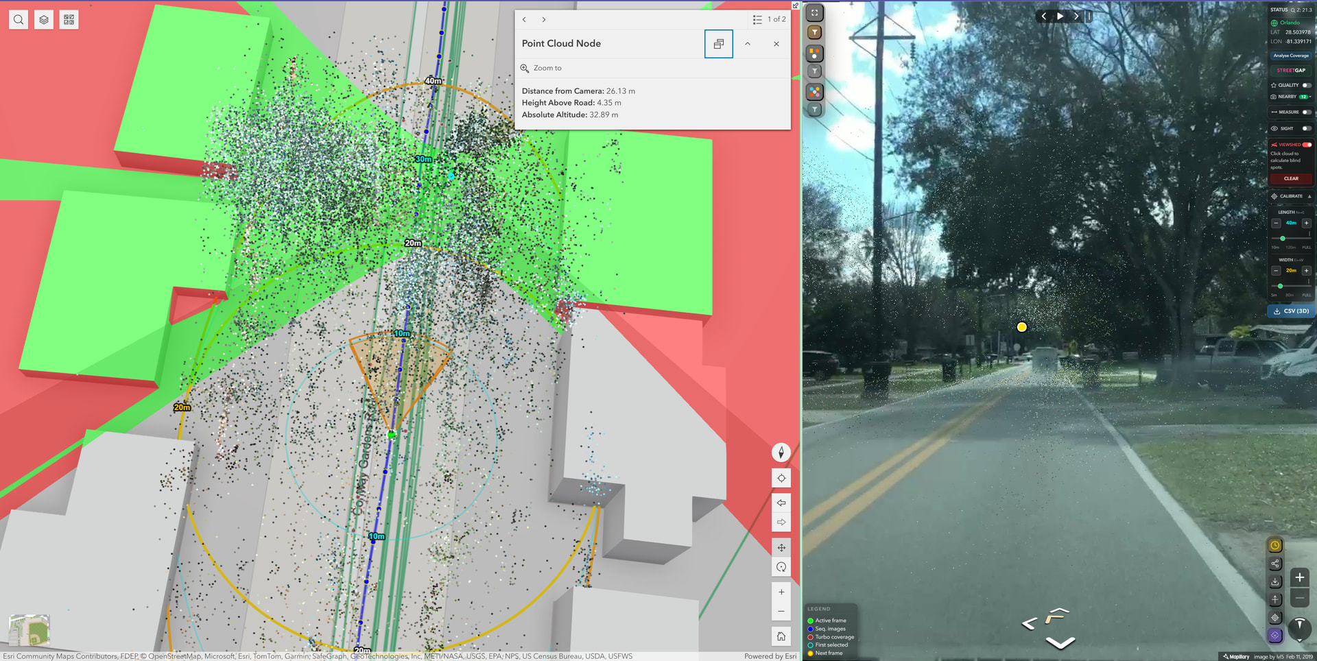
Full 3D compatibility has been introduced, enabling grounded visualization, enhanced exploration, and better spatial context.

In addition, the widget now includes Time Travel mode, Share Current View functionality, and the ability to download the current frame and AI detection overlays. Traffic signs and street objects can be exported in GeoJSON format, making them ready for use in ArcGIS, QGIS, or other GIS platforms.

AI overlay and asset management capabilities allow users to click on a traffic sign or object and immediately see which image frames contain that feature. Alternative frames are also listed, similar to the Mapillary web experience, allowing filtered exploration and deeper inspection of detected assets.

Also, I’m happy to share that the full Feature Series for the Mapillary Explorer Widget for ArcGIS Experience Builder is now complete.

The series is divided into two main parts. The first part focuses entirely on the widget’s settings and configuration, explaining each option in detail and how it affects behavior and performance. The second part shifts to a live demo environment, where I demonstrate real-world workflows.

The series includes 10 short videos(from numbers 1 to 10, max 3 min each):

  • Sync mode and map-centered behavior[2]

  • General, appearance, and advanced settings[4-7]

  • Full 3D scene support with grounded features and interactive visualization[8]

  • AI overlay & AI-detected traffic signs and street infrastructure assets, GeoJSON export functionality[9]

  • Utility tools such as Time Travel mode, Share Current View, and Download Current Frame with AI overlays[10]

Playlist:
https://www.youtube.com/playlist?list=PLogpD1OBtnx2rWy0p6al22It1EUOWxNEV

There is also an ArcGIS Online demo application available at the link below. You can explore the widget directly in a live environment(I recommend opening it in desktop format because I didn’t provide it through the widget controller), and it can be embedded into ArcGIS Online platforms. Please note that in the hosted demo, settings are predefined and cannot be modified.

If you want full control over configuration and customization, you can deploy your own application using ArcGIS Experience Builder Developer Edition. The widget is fully customizable and can also be integrated into enterprise environments.

The project is now fully type safe, improving maintainability and long-term stability. In the near future, I also plan to improve the current monolithic structure into a more modular architecture to encourage community engagement and contribution.

Please feel free to explore the ArcGIS Online demo application. You can leave feedback either in the comment section under the ArcGIS Online link or here in the forum. Your suggestions and ideas will help make the widget even better.

As many of you know, Oriented Imagery Catalog Classic has been deprecated, and we are also having problems with the current OIC solution in ArcGIS Online, and Esri Web AppBuilder is no longer maintained. With the transition toward ArcGIS Experience Builder as the modern framework, there is a growing need for flexible and extensible oriented imagery solutions.

This widget can serve as a modern alternative within the Experience Builder ecosystem. If you are looking for a way to integrate Mapillary imagery, AI-detected traffic signs, street assets, and export-ready geospatial workflows into your applications, you can channel that need into this project, and please do. :green_heart:

4 Likes

Wow - what a significant update! Thank you on the behalf of the whole community @sukruburakcetin !

2 Likes

As an ArcGIS user, I’m looking forward to checking out your Widget!! We are looking at uploading 360 video to Mapillary to assist with mapping utilities and infrastructure for local government projects. Hopefully we can utilize your tools. Thank you for your work on this!

2 Likes

Hi @FDC,

Great to hear that you’re planning to upload 360 videos to Mapillary. If you need any help to get started with, please feel free to connect with @Semir_Mapillary !

Hi everyone :green_heart:,

Just wanted to share that a new version of the Mapillary Explorer widget for ArcGIS Experience Builder is out, and it addresses several things that came up in this thread.

What is new in v4.1.0:

  • Shareable URL state. The browser URL now stays in sync with the active image, bearing, map position, and map type in real time. Copy the address bar at any point, and anyone opening that link will land on exactly the same view. A Share button in the viewer panel makes this even easier.
  • Coverage filtering at all zoom levels. The green Mapillary coverage layer now respects the start and end date, and panorama is or not filters(not only the default creator name) in Turbo Mode.
  • Deployment presets. Default creator, date range, and panorama filter can now be pre-configured from the settings panel, so the widget opens ready for specific use cases without any manual filter setup.
  • Performance improvements. Traffic sign and object feature layers now load significantly faster at zoom level 16 and above. Tile fetching, sprite sheet loading, and renderer icon loading all run in parallel instead of sequentially, which cuts load time by roughly 4 to 9 times depending on viewport size. The first time you cross the zoom threshold the layers now appear immediately with no debounce delay.
  • UX improvements. A loading indicator now appears while feature tiles are being fetched, so it is clear something is happening in the background. The direction arrow hover in fullscreen mode highlights the hovered direction on the minimap in yellow. The filter bar wraps to two rows at narrow widget widths instead of overflowing.
  • React 19 compatibility. Fully compatible with ArcGIS Experience Builder 1.19. All third-party UI dependencies have been removed and replaced with built-in components.

The project is now open for community contribution.

This release also marks a significant internal restructuring of the codebase. The widget has been refactored from a single large file into a modular architecture with dedicated components, utility files, and a typed interface layer. Pure utility functions live in isolated files with no React or ArcGIS dependencies, making them straightforward to test and extend. The main widget file is organized into clearly labeled feature regions so contributors can find their way around quickly.

If you have ever wanted to add a new filter type, extend the detection layer, contribute a new coverage renderer, or improve any part of the widget, this is a good time to get involved. The repository includes a full contribution guide and a compatibility reference for different ArcGIS versions.

Contributions of any size are welcome, whether that is a bug fix, a new feature, an improvement to the documentation, or feedback on what would make the widget more useful for your workflows.

https://github.com/sukruburakcetin/mapillary-explorer

**Live Demo:** :backhand_index_pointing_right: https://sukruburakcetin.github.io/mapillary-explorer-demo/


Important note for ArcGIS Enterprise users:

If you are running ArcGIS Enterprise 12.0, please note that it ships with Experience Builder 1.18, not 1.19. The prebuilt release from the releases page will work fine on Enterprise 12.0 without any changes. However, if you want to build the widget from source for an Enterprise 12.0 deployment, you must use Developer Edition 1.18, not 1.19. Building with 1.19 and deploying to Enterprise 12.0 can produce a bundle that fails to load due to JSAPI and React version mismatches. Full details are in COMPATIBILITY.md in the repository.

1 Like

Thank you @asturksever. I have upload several miles of 360 videos now from my GoPro Max2. We are using this to capture existing conditions of developments under construction as a surveying company. Most of our data will be collected at or below 25mph. My question is, would I get better quality results if I captured time lapse images at 1 or 2 seconds as opposed to video?

Hi @FDC for driving at 25 MPH we recommend video so that you can capture sufficient image density. You can see the detailed recommendations at https://help.mapillary.com/hc/en-us/articles/360012674619-GoPro-MAX-Series

@sukruburakcetin - love the updates and the live demo!!

Super cool - was this built using something like Manus?

Thank you, dear @boris, your feedback means a lot. :smiley:

Not Manus. I considered using Manus for the refactor, and it certainly could have been a powerful option, but even though the widget file was large, it wasn’t big enough to justify a fully autonomous tool. I planned the modular structure carefully on paper myself and used Claude Code to assist with parts of the implementation and boilerplate.

The refactor was important because it improved consistency, performance, and reliability, while making the widget easier for contributors to understand and extend. I also noticed the repository had a relatively low number of stars, which made me think the monolithic structure could have discouraged interested and engaged users from contributing, even though GitHub insights show the repository is actively used and tracked. This may be because some users are anonymous, hesitant, or not GitHub-native; I’m not sure. My goal was to make the project more approachable for pro users and better aligned with the quality standards I associate with Mapillary as part of Meta. :slight_smile:

1 Like

Hi everyone,
I wanted to share a new feature I added to the Mapillary Explorer widget that some of you working on coverage mapping might find useful.

What it does
When you are in Turbo Mode at street level zoom, you can now run a Street Coverage Analysis directly from the widget. It fetches the OSM road network for your current view, matches your loaded Mapillary coverage points against each road segment, and draws the result on the map in four colors showing how fresh the coverage is.

How the matching works
This is the part I found most interesting to build. The core question is: for a given road segment, which Mapillary images can be considered “coverage” for it, and how recent are they?
Each road segment from OSM gets one or more probe points depending on its length. Short segments under 20 meters use their midpoint. Longer segments use three probes at 25%, 50%, and 75% along the line. For each probe, the algorithm searches for Turbo coverage points within a snap threshold; the threshold varies by road type, so a motorway gets 20 meters and a residential street gets 8 meters, with one-way roads getting a 25% boost to account for dual carriageway offset.

All matching point indices across all probes are deduplicated using a Set, so the same coverage point does not get counted multiple times just because it falls within the range of two probes on the same segment.

The freshness classification
Here is where I made a deliberate design choice. An obvious approach is to take the most recent matching image and use its date to classify the segment. But this produces misleading results; if one person drove a street in 2024 and 15 other images are from 2018, the segment would show as fresh green even though the overwhelming majority of the documentation is six years old.
Instead, the algorithm uses a majority vote. It counts how many deduplicated matching points fall into each tier:

  • Fresh; captured within 2 years
  • Aging; 2 to 4 years old
  • Stale; older than 4 years

Whichever tier has the most matching points wins. Ties are broken in favour of the worst tier, so the widget never over-reports coverage quality. The covered/uncovered decision remains generous: any matching point counts as covered, but the color shown to the user reflects the dominant character of the imagery, not an outlier.

Edge stability
One thing that caused non-determinism early on was that Turbo coverage points are only loaded for the current view extent, so sequences that cross the view boundary get cut off. A segment near the edge might have half of its natural point neighbourhood missing, making its tier classification vary with pan position. The fix is a small inset on the analysis bbox; segments whose midpoint falls within 10 meters of the view edge are excluded from the result. A blue dashed rectangle on the map shows the exact zone that was analysed, so it is clear to the user why some edge segments are not colored. You can change the value in the code/constants.

Result
The InfoBox shows an overall coverage percentage, a segmented bar proportional to each tier, and a breakdown of kilometers and percentage per tier. The colored segments are drawn on the map with fresh on the bottom and uncovered on top, so problem areas are never hidden by green.

This feature came together partly because of a conversation here in the forum, where the user @osmplus_org mentioned he finds coverage analysis very helpful for planning his next mapping trips, which resonated with me. Since Mapillary Explorer is not just a viewer, it lets you explore coverage data in detail, and I wanted to go one step further than simply showing where images exist. Knowing that a street has been photographed is one thing, but knowing whether that photography is from last year or six years ago changes whether it is actually worth relying on or whether it needs to be resurveyed. The BBOX-based analysis gives you an honest picture of both how much of the visible area is covered and the quality of that coverage, so you can make a more informed decision about where to point your camera next.

That said, this works best for starting small areas or pilot regions where you want a quick directional read before heading out; it is not a precise audit tool, and the results should be treated as a helpful indicator rather than a guarantee. OSM road data, snap thresholds, and tile truncation at view boundaries all introduce some margin, but in practice, it is accurate enough to tell you where the obvious gaps are and whether the existing coverage is worth keeping or needs refreshing.

You can explore the feature either here(go to Zoom 16> LV on map and click Analyse Coverage Button on bottom of the right top infobox panel):

or simply here:

4 Likes